|
|
Post by laescoobyfan on Aug 1, 2012 21:02:46 GMT -5
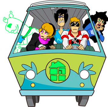
Which character design do you like more? 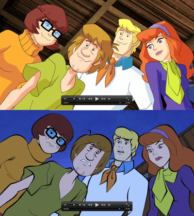 The top half is the regular character design for "Scooby-Doo! Mystery Incorporated". The bottom half is more like the clássic style. It is how the characters appeared in Scooby's dream in episode 14 of SDMI. Do you wish they would have used a style closer to the original for "Scooby-Doo! Mystery Incorporated"? Or are you happy they did something very different for this series? |
|
|
|
Post by laescoobyfan on Aug 1, 2012 21:26:46 GMT -5
I strongly perfer the original look. I really don't like the character design they have for this series. I don't like how there are points instead of curves. I don't like the very thin black lines. I don't like how their eyes are very small (Daphne's isn't though). I don't like how Velma has a thin neck in SDMI, or how Daphne's hair curls at the end. I don't like how they have colored eyebrows, or how Fred has a huge chin. These things are ugly and distracting to me, so I just try to ignore them.
I like the series, but I wish they would have used the style of Scooby's dream for all of it. I would be enjoying the series much more if that were the case.
|
|
|
|
Post by russm on Aug 2, 2012 2:43:04 GMT -5
When you put the two side-by-side then the obvious changes are in the SD:MI one Shaggy's hair is more shaggy while his nose looks more like a nose rather than a blob; Velma's face is more angular; Daphne has a more pointy chin and more hair-like hair and Fred has a bigger chin.
That aside the differences are not as great as I thought they were.
|
|
|
|
Post by ScoobyAddict on Aug 2, 2012 8:06:35 GMT -5
They are very close, but I will always prefer the original just because it was the first incarnation of Scooby. The animation in SDMI doesn't bother me at all. I think it is very well done!
|
|
|
|
Post by Doo on Aug 2, 2012 8:41:39 GMT -5
The original animation.
|
|
|
|
Post by UltimateScoobyFan on Aug 6, 2012 14:49:01 GMT -5
I like the original animation better.
|
|
|
|
Post by ahkyahnan on Aug 6, 2012 15:34:28 GMT -5
For Scooby as a whole, I prefer the old animation. That's what I like better in the movies.
The SD:MI style works great for that series though, and I really couldn't imagine the old animation style being used for it unless they changed the whole tone and style of the show to fit. It's kinda of its own show to begin with though, so that works.
The one thing I do like better about SD:MI is that Velma's hair doesn't look like a helmet. She looks more like a girl in SD:MI and less like someone's aunt.
Mark
|
|
|
|
Post by ilovescoobydoo on Aug 6, 2012 15:41:47 GMT -5
The original
|
|
|
|
Post by wileyk209 on Aug 8, 2012 9:22:06 GMT -5
Me too, though the new SD:MI designs aren't so bad. They remind me of the Flintstone character redesigns used on the 2001 TV movie "The Flintstones on the Rocks." 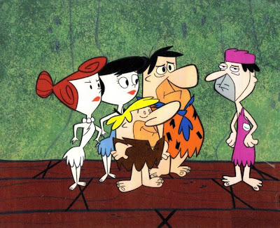 |
|
|
|
Post by Doo on Aug 8, 2012 9:24:06 GMT -5
Wow, they look a lot different than in the original 1960 versions!
|
|
|
|
Post by groovyscooby on Aug 8, 2012 12:10:40 GMT -5
I like the original more!!!!!  Nothing beats classic Scooby!!!!!!!!!!!! |
|
|
|
Post by Doo on Aug 8, 2012 12:13:13 GMT -5
Nope! I agree!
|
|
|
|
Post by laescoobyfan on Aug 9, 2012 0:24:03 GMT -5
For me, the style for SDMI just takes a very long time to get use to. I'm so use to seeing them in other shows, it is hard to adjust because this style is so different. I'm not a fan of that much change, so I still would have perfered them to use a style closer to the original.
|
|
|
|
Post by ThatRainbowGirl on Aug 13, 2012 13:43:58 GMT -5
I have nothing against the original style in general, but seeing SD:MI with it would be... weird. Like ahkyahnan said, the old animation just doesn't fit the tone of the new series. I can't describe exactly how without feeling like I'm saying something wrong, but it really just wouldn't work at all.
|
|
|
|
Post by j3h on Aug 13, 2012 14:15:41 GMT -5
well, not trying to open any can of worms here, but since this is my opinion...
I like the new Mystery Inc Style for Mystery Inc since it is a seperate entity from the previous instaments of the franchise. A modern new style for a reboot.
I like how the gang has a neo-classic look in the newer DTVs. The color work and shadowing on those designs are fantastic. (Abbracadabra and onwards)
The look for Get a Clue was Not to my liking at all, which is fine because that show was kinda lousy anyway (also thankfully not part of any continuity, so it can be 100% completely safely ignored and forgotten about)
I thought the look for What's new was fine for that time and that show, but it kind of wore it self out once that show ended and was still used in a few remaining DTVs.
And the Classic look is....well, just CLASSIC!
|
|


 Nothing beats classic Scooby!!!!!!!!!!!!